


最新下载
热门教程
- 1
- 2
- 3
- 4
- 5
- 6
- 7
- 8
- 9
- 10
html+css实现响应式卡片悬停效果代码示例
时间:2022-06-25 17:52:44 编辑:袖梨 来源:一聚教程网
本篇文章小编给大家分享一下html+css实现响应式卡片悬停效果代码示例,文章代码介绍的很详细,小编觉得挺不错的,现在分享给大家供大家参考,有需要的小伙伴们可以来看看。
效果:
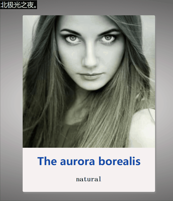
卡片悬停,响应式卡片,简约效果。
实现:
1. 定义标签,.kapian为最底层盒子,然后两个子盒子一个放图片,一个放文本:

                The aurora borealis
                natural

                    Aurora Borealis is a colorful luminous phenomenon that appears over the high magnetic latitude region of the planet's North Pole.
                    I love the aurora borealis. It's so beautiful.
2.先定义底层盒子的css基本样式,长宽等,就不详细说明了:
 .kapian{
            position: relative;


            border-radius: 3px;
            background-color: #fff;
            box-shadow: 2px 3px 3px rgb(139, 138, 138);
            overflow: hidden;
            cursor: pointer;
            transition: all 0.3s;
        }
        .kapian:hover{
            box-shadow: 2px 3px 10px rgb(36, 35, 35);
        }
:hover鼠标经过后盒子阴影变化。
transition: all 0.3s;过渡效果,阴影在0.3s内慢慢变化
3. 图片的基本样式,采用绝对定位:
.tu{
            position: absolute;
            top: 0;
            left: 0;
            width: 100%;

            overflow: hidden;

        }
        .tu img{
            width: 100%;
            height: 100%;
            transition: all 0.5s;
        }
        .kapian:hover .tu img{
            transform: scale(1.2);
            filter: blur(1px);
        }
:hover鼠标经过后图片变大,而且变模糊;
transform: scale(1.2);图片变大为1.2倍;
filter: blur(1px);图片变模糊;
4 .定义装文本这个盒子的基本样式,采用绝对定位:
.wenben{
            position: absolute;
            bottom: -200px;
            width: 100%;

            background-color: rgb(247, 242, 242);
            transition: 0.5s;
        }
        .kapian:hover .wenben{
            bottom: 0px;
        }
:hover鼠标经过后文本框绝对定位的bottom发生改变,使得呈现文本框向上展开的效果;
5 .文本框里字符的样式:
.wenben h2{
            color: rgb(21, 74, 172);
            line-
            text-align: center;

        }
        .wenben p{
            padding: 0 30px;
            font-family: 'fangsong';
            font-size: 16px;
            font-weight: bold;
            line-
            text-align: center;
        }
完整代码:
                The aurora borealis
                natural

                    Aurora Borealis is a colorful luminous phenomenon that appears over the high magnetic latitude region of the planet's North Pole.
                    I love the aurora borealis. It's so beautiful.
相关文章
- 卡厄思梦境经验值如何获取 07-22
- 宝石战争罗文尼获取方法 宝石战争罗文尼配队推荐 07-22
- 宝石战争手游阵容推荐 宝石战争常用阵容分享 07-22
- 笼子超好玩多人联机恐怖游戏如何玩 07-22
- 龙之谷:启程天赋系统解读 07-22
- 宝石战争魔头宝箱在哪 宝石战争魔头宝箱位置指引 07-22