


最新下载
热门教程
- 1
- 2
- 3
- 4
- 5
- 6
- 7
- 8
- 9
- 10
CSS3如何实现图形下落动画效果 CSS3实现图形下落动画效果代码示例
时间:2022-06-25 14:02:34 编辑:袖梨 来源:一聚教程网
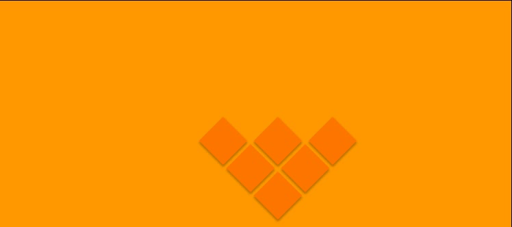
CSS3如何实现图形下落动画效果?本篇文章小编给大家分享一下CSS3实现图形下落动画效果代码示例,文章代码介绍的很详细,小编觉得挺不错的,现在分享给大家供大家参考,有需要的小伙伴们可以来看看。
先看效果
实现代码
css;">* {
  margin: 0;
  padding: 0;
  box-sizing: border-box;
}
body {
  width: 100%;
  height: auto;
  background: #f90;
  overflow: hidden;
}
.box {


  background: #f70;
  transform: rotate(45deg);
  position: absolute;
  box-shadow: 2px 2px 3px rgba(0, 0, 0, 0.3);
}
.box1 {
  left: calc(50% - 25px);
  top: calc(100% - 75px);
  animation: box1 cubic-bezier(1, 0, 0.45, 1.4) 2s 1;
}
.box2 {
  left: calc(50% - 65px);
  top: calc(100% - 115px);
  animation: box2 cubic-bezier(1, 0, 0.45, 1.4) 2.5s 1;
}
.box3 {
  left: calc(50% + 15px);
  top: calc(100% - 115px);
  animation: box3 cubic-bezier(1, 0, 0.45, 1.4) 3s 1;
}
.box4 {
  left: calc(50% + 55px);
  top: calc(100% - 155px);
  animation: box4 cubic-bezier(1, 0, 0.45, 1.4) 3.5s 1;
}
.box5 {
  left: calc(50% - 105px);
  top: calc(100% - 155px);
  animation: box5 cubic-bezier(1, 0, 0.45, 1.4) 4s 1;
}
.box6 {
  left: calc(50% - 25px);
  top: calc(100% - 155px);
  animation: box6 cubic-bezier(1, 0, 0.45, 1.4) 4.5s 1;
}
@keyframes box1 {
  from {
    top: -100px;
  }
  to {
    top: calc(100% - 75px);
  }
}
@keyframes box2 {
  from {
    top: -100px;
  }
  to {
    top: calc(100% - 115px);
  }
}
@keyframes box3 {
  from {
    top: -100px;
  }
  to {
    top: calc(100% - 115px);
  }
}
@keyframes box4 {
  from {
    top: -100px;
  }
  to {
    top: calc(100% - 155px);
  }
}
@keyframes box5 {
  from {
    top: -100px;
  }
  to {
    top: calc(100% - 155px);
  }
}
@keyframes box6 {
  from {
    top: -100px;
  }
  to {
    top: calc(100% - 155px);
  }
}
相关文章
- 维咔VikACG(V站)-肥宅们的欢乐家园 07-21
- 魔王终局之青玉刑天流派玩法指南 07-21
- 幻兽帕鲁古代熔岩块怎么获取 07-21
- 魔兽世界毁坏工程任务指南 07-21
- 基于Csharp实现平滑流畅的进度条ProgressBar 07-21
- SpringIoC容器与Bean管理全解析 07-21