


最新下载
热门教程
- 1
- 2
- 3
- 4
- 5
- 6
- 7
- 8
- 9
- 10
纯CSS实现3D按钮效果的实例解析
时间:2022-06-25 09:27:29 编辑:袖梨 来源:一聚教程网
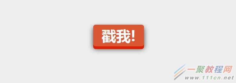
今天分享一个用纯CSS实现的3D按钮。
css巧妙利用了box-shadow来实现3D物体的立体感,当按钮按下的时候再去修改box-shadow和top值。
让人感觉有一种按钮被按下的感觉。css代码非常少,如下所示:
|
a.css-3d-btn{
position:relative;
color: rgba(255,255,255,1);
text-decoration:none;
background-color: rgba(219,87,51,1);
font-family:"Microsoft YaHei", 微软雅黑, 宋体;
font-weight:700;
font-size:3em;
display:block;
padding:4px;
border-radius:8px;
/* let's use box shadows to make the button look more 3-dimensional */
box-shadow:0px9px0pxrgba(219,31,5,1),0px9px25pxrgba(0,0,0, .7);
margin:100pxauto;
width:160px;
text-align:center;
-webkit-transition:all.1s ease;
-moz-transition:all.1s ease;
transition:all.1s ease;
}
/* now if we make the box shadows smaller when the button is clicked, it'll look like the button has been "pushed" */
a.css-3d-btn:active{
box-shadow:0px3px0pxrgba(219,31,5,1),0px3px6pxrgba(0,0,0, .9);
position:relative;
top:6px;
}
|
效果如下:
相关文章
- 天猫店铺托管服务 - 专业代运营解决方案 06-24
- 手机学日语的软件有哪些 06-24
- 好玩的打工游戏有哪些 2026流行的打工游戏排行 06-24
- 半塘网 - 专注原创内容分享的中文社区 06-24
- 免费听书APP推荐:2026年热门手机听书软件排行榜 06-24
- 淘宝云客服清退后多久可以再次报名:淘宝云客服被清退还能再报名么 06-24